How to help buyers quickly understand what your product helps them do, what problem it supports, and whether it is the right fit.
A product can include many useful things and still feel confusing.
It can have guides.
Templates.
Checklists.
Worksheets.
Bonuses.
Examples.
Videos.
Swipe files.
Resource lists.
All of that may be valuable.
But if the buyer does not quickly understand what the product helps them do, the offer can feel unclear.
That is why your product needs a clear promise.
A promise tells the buyer:
This is what this product helps you move toward.
It does not need to be loud.
It does not need to be exaggerated.
It does not need to claim everything.
In fact, the best promise is honest, specific, and easy to understand.
It helps the right buyer see the fit quickly.
And if the product is not for their current problem, that is okay too.
Good offer clarity is not about convincing everyone.
It is about helping the right people make a confident decision.
Why a Clear Promise Matters
Buyers do not start by caring about your file list.
They start by caring about their problem.
They are wondering:
- Is this for me?
- Does this solve the problem I have now?
- Will this help me take the next step?
- Do I understand what I will be able to do?
- Is this too advanced, too basic, or just right?
- Can I trust the person explaining it?
A clear promise answers those questions faster.
It gives the buyer a simple reason to keep reading.
Without a clear promise, the buyer may see a long list of features and still feel unsure.
They may think:
“This includes a lot… but what does it actually help me do?”
That is not the buyer’s fault.
That is an offer clarity problem.
The Big Mistake Product Creators Make
The big mistake is leading with the inventory instead of the outcome.
Many creators start by listing everything inside the product:
- 10 guides
- 20 templates
- 5 checklists
- 3 bonus modules
- 50 prompts
- 12 worksheets
Those details can be useful later.
But they should not carry the whole offer.
A feature list tells buyers what they receive.
A promise tells buyers why it matters.
For example:
Feature-First Message
You get 12 worksheets, 5 templates, 3 checklists, and a bonus planning guide.
This tells the buyer what is included.
But the buyer may still wonder what it helps them accomplish.
Promise-First Message
This helps you plan one small starter offer with a clear buyer problem, product format, promise, and next step.
Now the buyer understands the purpose.
After that, the worksheets and templates make more sense.
The features support the promise.
They do not replace it.
The Clear Promise Framework
Use this simple framework:
- Name the buyer problem
- Name the useful outcome
- Show the movement
- Define who it is for
- Be honest about who it is not for
This helps your promise become clear without becoming hype.
Step 1: Name the Buyer Problem
A clear promise begins with the buyer’s problem.
Not your product.
Not your file count.
Not your bonus stack.
The buyer’s problem.
For example:
- They have a product idea but cannot explain it clearly.
- They have PLR content but it sounds too generic.
- They have old blog posts but do not know what to refresh.
- They want to reconnect with their email list but feel awkward.
- They have too many ideas and no simple offer path.
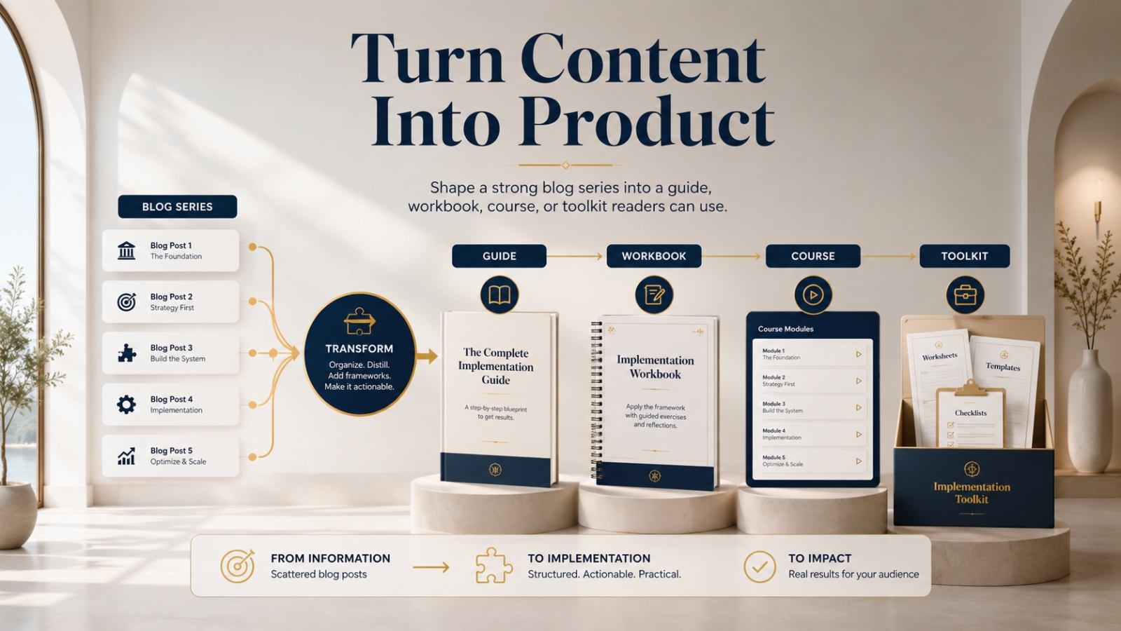
- They have a blog series but do not know how to turn it into a product.
When you name the problem clearly, the right buyer feels seen.
They think:
“Yes, that is what I am dealing with.”
That moment matters.
Problem Question
Ask:
What problem is the buyer trying to solve when they look at this product?
If you cannot answer that clearly, the product promise will be weak.
Step 2: Name the Useful Outcome
The outcome tells the buyer what the product helps them do.
This should be practical and specific.
Not vague.
For example:
Weak outcome:
Improve your digital business.
Clearer outcome:
Plan one small starter offer with a clear promise and simple structure.
Weak outcome:
Create better content.
Clearer outcome:
Turn one blog series into a guide, workbook, course, or toolkit.
Weak outcome:
Grow your authority.
Clearer outcome:
Build trust by using research, experience, clarity, documentation, and helpful guidance in your content.
A useful outcome gives the buyer something they can picture.
Outcome Question
Ask:
After using this product, what should the buyer be able to do, decide, create, or improve?
That answer belongs near the top of your offer.
Step 3: Show the Movement
A promise becomes stronger when it shows movement.
The buyer is moving from one state to another.
Examples:
- From scattered ideas to one focused offer
- From generic PLR to more original product content
- From old posts to refreshed content assets
- From email silence to one helpful reconnection note
- From a blog series to a usable digital product
- From confusion to a clear next step
This movement helps buyers understand the transformation.
Information tells them what is inside.
Transformation shows what changes.
Movement Formula
Use this formula:
This helps you move from [starting state] to [desired state] without [common friction].
Examples:
This helps you move from a vague product idea to one clear starter offer without building a huge product first.
This helps you move from an old weak blog post to a refreshed article with a stronger title, intro, examples, formatting, and next step.
This helps you move from a quiet email list to one helpful reconnection message without writing a long apology.
You do not have to use the formula word for word.
But the thinking behind it is useful.
Starting state.
Desired state.
Reduced friction.
That is a strong promise.
Step 4: Define Who It Is For
A clear promise should help the right buyer self-identify.
Do not be afraid to say who the product is for.
For example:
This is for beginner digital product creators who have ideas, PLR content, or templates but need help turning them into one small focused offer.
That is clearer than:
This is for everyone who wants to make money online.
A good “who it is for” statement makes the offer feel more trustworthy.
It shows that you are not trying to sell to everyone.
Fit Question
Ask:
Who has the exact problem this product is designed to help with?
Write that clearly.
Step 5: Be Honest About Who It Is Not For
This is where trust grows.
A clear promise should not pretend the product is right for every buyer.
If it is not a fit, say so.
That may feel risky, but it builds credibility.
For example:
This is not for you if you are looking for advanced funnel strategy, paid ads training, or a complete business automation system. This is for creating one clear starter offer first.
That kind of honesty helps the right buyer feel safer.
It also reduces disappointment.
A buyer who needs advanced support should not buy a beginner starter kit and feel misled.
Offer clarity protects both sides.
Not-For Question
Ask:
Who would not be served well by this product right now?
This helps you set honest boundaries.
The 3-Second Promise Test
Your product promise should be visible quickly.
In a few seconds, the buyer should understand:
- what the product helps with
- who it is for
- what problem it addresses
- what result it supports
This is not about using loud hype.
It is about making the value easy to see.
Weak 3-Second Message
The Ultimate Digital Product Toolkit
This sounds big, but it does not explain enough.
Stronger 3-Second Message
Plan one small starter offer from your ideas, PLR content, or templates — without building a huge product first.
This is clearer.
The buyer knows what the product helps them do.
Weak 3-Second Message
Content Growth Bundle
Vague.
Stronger 3-Second Message
Turn one strong blog series into a guide, workbook, course, or toolkit your readers can use.
Clearer.
The buyer can picture the result.
Weak 3-Second Message
Email Re-Engagement Pack
Better, but still incomplete.
Stronger 3-Second Message
Write one helpful reconnection email after a quiet season without overexplaining the silence.
Now the promise is specific.
What to Put Before the Feature List
Before listing the files, add a short promise section.
You can use this structure:
Product Promise
This helps you [do X] so you can [reach Y] without [common problem].
Best For
This is for [specific buyer] who wants to [specific outcome].
Not For
This is not for [buyer/problem mismatch].
What You Will Create or Complete
By the end, you will have [visible result].
Only after that should you list the files.
Now the features have context.
The buyer understands why each piece matters.
Worked Example: Clear Promise for a Small Offer
Let’s use a product example.
Product Name
Starter Offer Planning Checklist
Feature-First Version
Includes:
- 10-page checklist
- product idea worksheet
- offer promise prompts
- format selector
- final review page
This is useful, but incomplete.
Now let’s make it promise-first.
Promise-First Version
Starter Offer Planning Checklist helps beginner product creators turn one idea, PLR piece, or template into a small focused offer with a clear buyer problem, simple format, honest promise, and next step.
Best For
This is for beginners who feel overwhelmed by large product ideas and want to create one small offer first.
Not For
This is not for advanced sellers looking for full funnel strategy, paid advertising, or complex launch planning.
What You Will Complete
By the end, you will have one starter offer idea mapped with:
- buyer problem
- product format
- clear promise
- included pieces
- next step
What Is Included
- starter offer checklist
- buyer problem worksheet
- product format selector
- promise-writing prompt
- final offer review page
Now the feature list feels stronger because the buyer understands the purpose.
The files are not random.
They support the promise.
How to Rewrite a Feature Into a Promise
Here is a simple way to improve product messaging.
Feature
Includes a 20-page workbook.
Better Promise
Use the workbook to choose one buyer problem, plan your product format, and write a clear offer promise.
Feature
Includes 50 headline prompts.
Better Promise
Use the prompts to write clearer headline options without starting from a blank page.
Feature
Includes a bonus checklist.
Better Promise
Use the checklist to review your offer before publishing so the buyer’s next step is easier to understand.
Feature
Includes email templates.
Better Promise
Use the templates to write a helpful reconnection email after a quiet season without overexplaining the silence.
Features matter.
But they become stronger when you explain what they help the buyer do.
How Honest Clarity Improves Trust
Honest clarity means you do not oversell the product.
You explain the fit.
You explain the limit.
You make the promise specific.
You avoid pretending it solves every problem.
That kind of messaging can feel calmer and more premium.
It also attracts better-fit buyers.
A buyer who understands the promise is more likely to use the product properly.
A buyer who understands who it is not for is less likely to feel disappointed.
That is good business.
Honest Promise Examples
Instead of Saying:
This gives you everything you need to build a successful product business.
Say:
This helps you plan your first small starter offer so you can move from idea to clearer product structure.
Instead of Saying:
This product is perfect for everyone.
Say:
This is best for beginners who need one focused starting point, not advanced sellers looking for complex funnel strategy.
Instead of Saying:
You will get results fast.
Say:
This gives you a simple structure to make the next step easier to complete.
Honesty does not weaken the offer.
It strengthens trust.
What to Avoid When Writing a Product Promise
Mistake 1: Leading With the File List
Files are not the promise.
Explain the outcome first.
Then show the files that support it.
Mistake 2: Making the Promise Too Broad
A broad promise feels impressive but unclear.
Make the promise specific enough to picture.
Mistake 3: Promising a Result the Product Cannot Control
Do not promise outcomes that depend on the buyer’s effort, market, audience, or execution.
Promise what the product helps them do.
Mistake 4: Hiding Who It Is Not For
If the product is not a fit for certain buyers, say so.
This helps protect trust.
Mistake 5: Using Clever Names Without Clear Meaning
A clever product name is fine, but it still needs a clear promise.
Do not make buyers guess what the product does.
Quick Exercise: Write Your Product Promise
Use this worksheet.
My Product Is:
[Write product name.]
The Buyer Problem Is:
[Write the problem.]
The Product Helps the Buyer:
[Write what it helps them do.]
The Starting State Is:
[Where is the buyer before using it?]
The Desired State Is:
[Where should they be after using it?]
The Product Is Best For:
[Write who it is for.]
The Product Is Not For:
[Write who it is not for.]
The Visible Result Is:
[Write what the buyer will create, decide, complete, or improve.]
My Clear Product Promise Is:
[Write one clear promise.]
That one promise can improve your sales page, product page, email, and offer description.
Final Thought: Clarity Is Part of the Product Experience
A clear promise helps buyers understand your product quickly.
It tells them what problem the product supports.
It shows what the product helps them do.
It helps them decide whether it fits their current need.
And it gives your features a reason to matter.
That is why your product promise should appear before the file list.
Not because features are unimportant.
But because buyers need context first.
They need to know:
Is this for my problem?
Will this help me take the next step?
What will I be able to do with it?
Answer those questions honestly and early.
If the product is a fit, the buyer will understand faster.
If it is not, they can move on with clarity.
That is not a loss.
That is trust.
And trust is the foundation of long-term product growth.
Use This With Blogger’s Success Toolkit
If you already own Blogger’s Success Toolkit, log in to the Blogger Success Blueprint members area and review one product, offer, or resource description.
Before listing what is included, write one clear promise that explains what the product helps the buyer do, what problem it supports, and who it is best suited for.
Members Login:
https://bloggersuccessblueprint.com/members/
New to Blogger’s Success Toolkit?
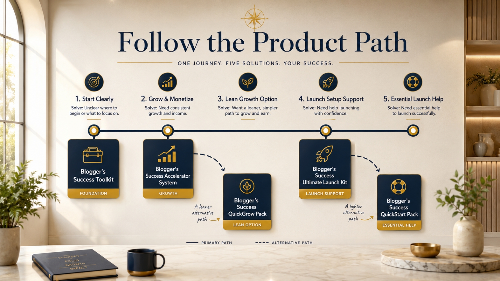
Blogger’s Success Toolkit gives you a beginner-friendly path to choose your direction, plan useful content, write stronger titles, and begin building your blog or product path with more structure.
Learn More About Blogger’s Success Toolkit
Featured Image Guidelines
Blog Post: Why Your Product Needs a Clear Promise
Tagline: Help buyers quickly understand what your product helps them do and whether it fits their problem.
Creative Featured Image Direction:
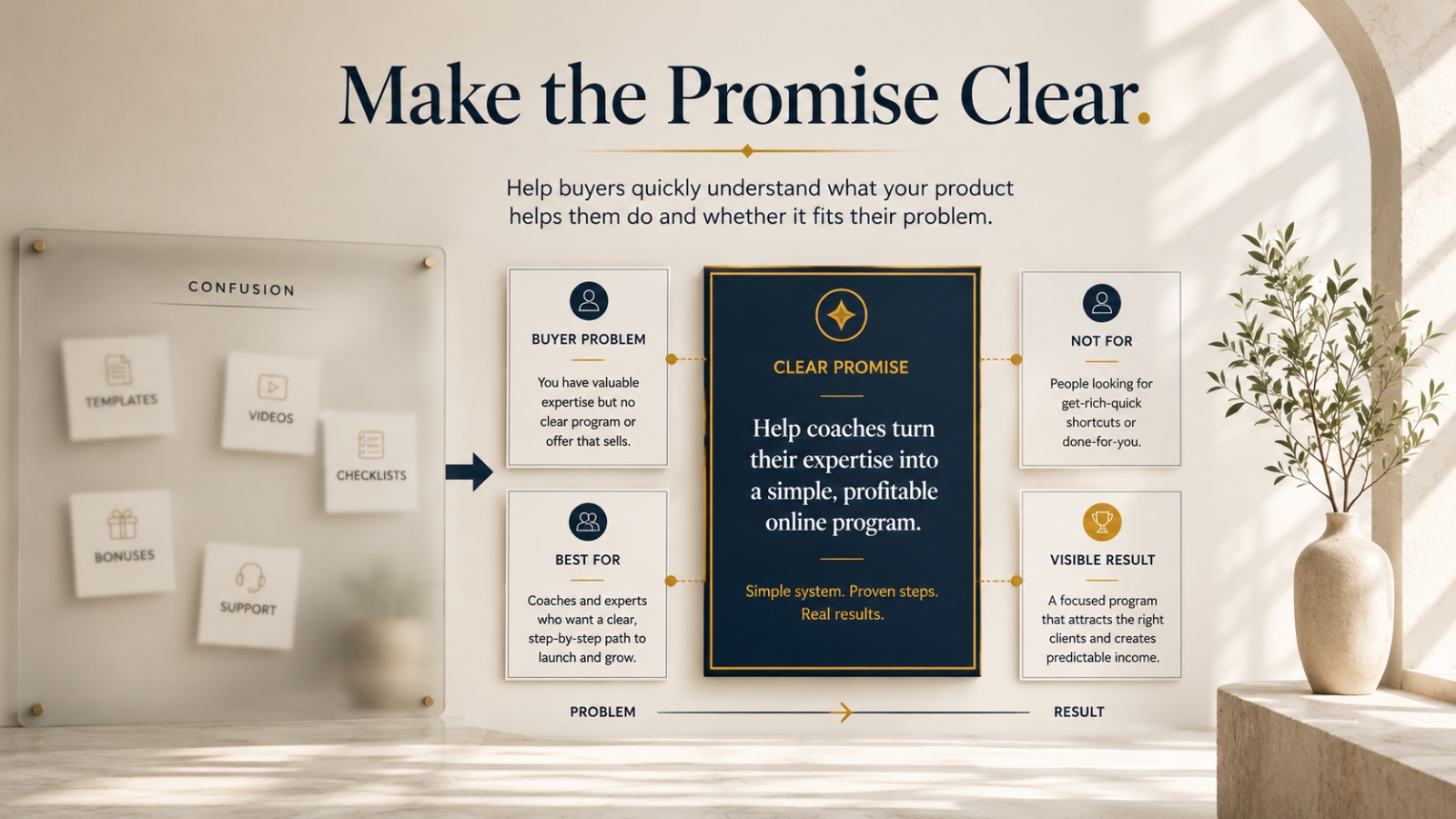
Create a premium, realistic blog header image that feels like a calm offer clarity studio.
Show a product offer being clarified from a confusing feature list into one clear promise. Include visual cues such as:
- Buyer Problem
- Clear Promise
- Best For
- Not For
- Visible Result
Use a creative visual metaphor such as:
- a foggy product board becoming a clear promise panel
- scattered feature cards being organized under one strong outcome
- a spotlight on one clear promise above smaller supporting features
- a refined offer-positioning wall showing “Problem → Promise → Result”
Avoid clutter, loud sales graphics, hype-style visuals, piles of files, product stacks, dashboards, laptops, or anything that feels like exaggerated marketing.
Use brand colors tastefully:
- dark navy blue #132636 for structure, labels, or promise panel
- gold #de9f00 for the clear promise, visible result marker, or key highlight
The image should feel honest, premium, and trust-building — showing that a strong offer helps buyers quickly understand whether the product is right for them.
Most Suitable Text Overlay:
Make the Promise Clear
Best File Name:
why-your-product-needs-a-clear-promise.jpg
Excellent, Peter — Week 63 is a very important product-growth lesson. I’ll focus this on the buyer experience after purchase: clean delivery, clear order, helpful onboarding, and simple support so buyers actually use what they bought.
Polish checks completed: this version uses clear Block 8 Week 63 positioning, SEO Tags, a buyer-experience framework, delivery/onboarding guidance, practical examples, and a simple featured image guideline section.
Block / Week / Topic
Block / Week: Block 8, Week 63
Topic: How to Create a Better Buyer Experience
Message Focus: Delivery and onboarding
Core Idea: A better buyer experience helps people understand what they bought, where to begin, how to use the product, what order to follow, and where to get support.
Blog Post Setup
Parent Category: Authority & Long-Term Growth
Category: Authority & Growth
Category Description: Authority & Growth helps readers strengthen their blog’s credibility, deepen audience trust, and build long-term growth assets. This category covers advanced content strategy, authority positioning, expert-style content, product expansion, audience trust, and sustainable ways to grow beyond the beginner stage.
SEO Tags: buyer experience, product delivery, customer onboarding, digital product delivery, members area, download page, welcome email, product onboarding, customer support path, digital product strategy, authority and growth, Blogger Success Blueprint
Slug: how-to-create-a-better-buyer-experience
Recommended Email Subject
Make your product easier to use after purchase
Alternative Subject Lines
- A better buyer experience starts after checkout
- Don’t leave buyers wondering where to begin
- Your product delivery matters more than you think
- Help buyers use what they just bought
- A simple onboarding path for digital products
Hi {{ subscriber.first_name | capitalize }},
A product is not finished when someone buys it.
That is where the buyer experience begins.
After purchase, your buyer should quickly understand:
- where to access the product
- what to download first
- what order to follow
- how to use the main resources
- where to get help if they are stuck
This does not need to be complicated.
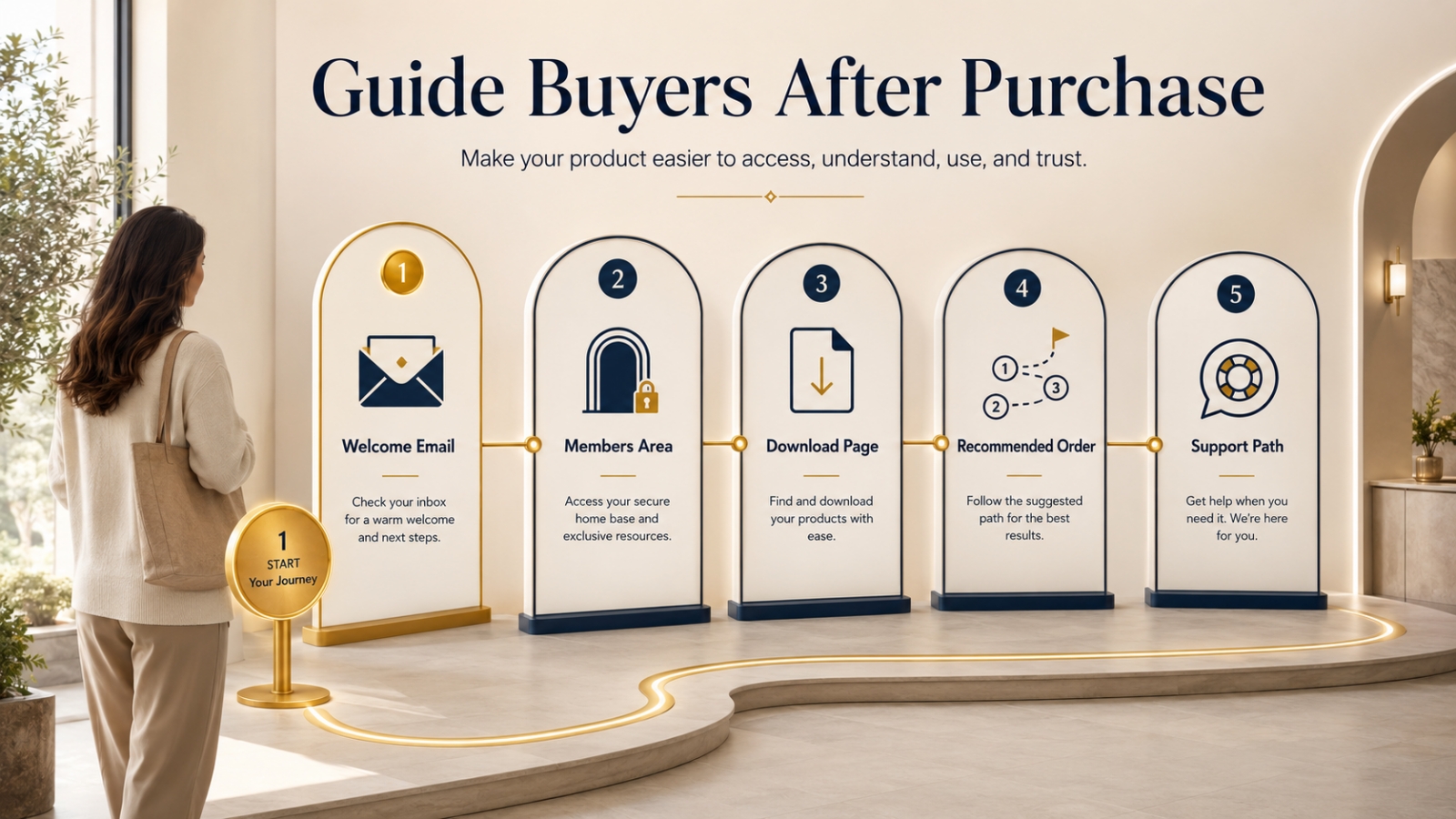
A clean members area, clear download page, simple welcome email, recommended order, and easy support path can make a big difference.
When buyers feel guided, they are more likely to use the product.
And when they use the product, they are more likely to trust you.
I wrote a full guide on Blogger Success Blueprint showing how to create a better buyer experience after purchase.
You can read it here:
[Insert Blog Post Link]
Regards,
Peter Teo
How to Create a Better Buyer Experience
How to make your digital product easier to access, understand, use, and trust after purchase.
A buyer’s experience does not end at checkout.
It begins there.
That moment matters.
The buyer has just decided to trust you.
They clicked the button.
They completed the purchase.
They opened the confirmation email.
They entered the members area or download page.
Now they are quietly asking:
Where do I begin?
What did I buy?
What should I open first?
Which file matters most?
Do I need to download everything?
Where do I go if I need help?
If those questions are not answered clearly, the product can start to feel confusing before the buyer even uses it.
That is why delivery and onboarding matter.
A strong product is not only about what is inside.
It is also about how clearly the buyer can access it, understand it, and begin using it.
Why Buyer Experience Matters
A buyer may purchase because the offer sounds useful.
But they continue trusting you because the delivery feels clear.
A messy delivery experience can make even a good product feel weaker.
The buyer may feel overwhelmed.
They may not know which file to open first.
They may miss important resources.
They may never use the product fully.
They may contact support for questions that could have been answered on the download page.
That is not ideal.
A better buyer experience reduces friction.
It helps the buyer feel:
“I know where I am. I know what I bought. I know what to do first.”
That feeling builds trust.
The Big Mistake Product Creators Make
The big mistake is thinking product delivery is only about giving access.
The creator thinks:
“The buyer has the files. My job is done.”
But access is only one part of delivery.
The buyer also needs guidance.
A folder full of files is not the same as a clear product experience.
A members area with many downloads but no order can feel confusing.
A confirmation email without next steps can feel cold.
A bonus section with no explanation can feel like a storage room.
A product should not feel like the buyer walked into a warehouse.
It should feel like they walked into a simple, well-labeled learning space.
The Better Buyer Experience Framework
A good digital product experience needs five simple parts:
- Clean members area
- Clear download page
- Welcome email
- Recommended order
- Simple support path
These do not need to be fancy.
They need to be clear.
Let’s walk through each one.
1. Clean Members Area
Your members area should help the buyer feel oriented.
When they log in, they should quickly understand where things are.
A clean members area does not mean expensive design.
It means the layout is easy to follow.
The buyer should not need to hunt for the main product.
What a Clean Members Area Includes
A clean members area may include:
- clear product name
- short welcome note
- simple navigation
- main product section
- bonus section
- license or usage information if needed
- support link
- recommended order
- download buttons that are easy to find
Keep the structure simple.
Do not make the buyer click through too many pages before they can begin.
Members Area Question
Ask:
If a buyer logs in for the first time, can they understand where to start within 30 seconds?
If not, simplify the layout.
2. Clear Download Page
The download page is one of the most important buyer experience pages.
This is where the buyer receives the product.
A good download page should explain what each section is for.
Do not only list file names.
File names alone may not help the buyer understand the value.
For example, instead of only showing:
Module 1.pdf
Add a short explanation:
Module 1: Start Here Guide — Use this first to understand the product path and recommended order.
That small explanation helps.
What a Clear Download Page Includes
A clear download page should include:
- product title
- short welcome message
- “Start Here” section
- main product downloads
- bonus downloads
- recommended use order
- file format notes
- access instructions
- support link
The goal is to reduce guessing.
Download Page Question
Ask:
Can the buyer tell what each file is and why it matters?
If not, add short descriptions.
3. Welcome Email
The welcome email is the buyer’s first guided message after purchase.
It should be simple, warm, and practical.
The goal is not to sell again immediately.
The goal is to help the buyer access and use what they bought.
A good welcome email should include:
- thank you note
- access link
- what to do first
- recommended order
- support contact
- reassurance that they do not need to use everything at once
This helps the buyer feel guided.
Simple Buyer Welcome Email Example
Hi {{ customer.first_name | capitalize }},
Thank you for getting [Product Name].
You can access your product here:
[Insert Members Area Link]
I recommend starting with the Start Here Guide first. It will show you what is included, what order to follow, and how to use the main resources without feeling overwhelmed.
A simple order is:
- Read the Start Here Guide
- Open the main training or guide
- Use the worksheet or checklist as you go
- Review the bonuses after the main product
If you need help, you can contact support here:
[Insert Support Link]
Take it one step at a time.
Regards,
Peter Teo
That email is clear.
It tells the buyer what to do next.
Welcome Email Question
Ask:
Does this email help the buyer begin, or does it only give them a link?
A good welcome email guides.
4. Recommended Order
Many digital products include several parts.
Main guide.
Videos.
Worksheets.
Checklists.
Templates.
Bonuses.
License files.
Support documents.
If the buyer sees everything at once, they may not know what to open first.
That is why a recommended order matters.
You can say:
Start here. Then go here. Use this while you work. Open these bonuses after the main product.
This is simple, but powerful.
Example Recommended Order
For a digital product toolkit, the order might be:
- Start Here Guide
- Core Training Guide
- Action Workbook
- Templates
- Checklists
- Bonuses
- License and support documents
For a PLR product, the order might be:
- Read the Start Here Guide
- Review the PLR License
- Open the main product files
- Customize the editable files
- Review the sales materials
- Prepare your delivery page
- Use promotional assets when ready
The order should match the product.
Do not assume the buyer knows.
Recommended Order Question
Ask:
What sequence would help the buyer get value with the least confusion?
Then place that order clearly on the download page and in the welcome email.
5. Simple Support Path
A buyer should know where to get help.
Support does not need to be complicated.
But it should be visible.
A simple support path may include:
- support email
- support form
- FAQ page
- “How to access your files” section
- “What to do if a download does not work” note
- expected response window if relevant
This reduces frustration.
It also reduces repeated questions.
Support Path Example
You can write:
Need help? Visit the support page here: [Insert Support Link]. Please include your purchase email and a short description of the issue so we can help faster.
That is clear.
Support Path Question
Ask:
If the buyer gets stuck, can they quickly see where to go?
If not, make support easier to find.
Worked Example: Improving a Digital Product Delivery Page
Let’s imagine you sell a product called:
Starter Offer Builder Toolkit
The product includes:
- guide
- workbook
- offer promise template
- product format selector
- final review checklist
- bonus examples
Weak Delivery Page
The download page says:
Downloads:
- Guide.pdf
- Workbook.pdf
- Template.docx
- Checklist.pdf
- Bonus.pdf
This gives access, but not guidance.
The buyer may wonder:
Which file first?
What is the template for?
Do I need the bonus now?
How do these fit together?
Better Delivery Page
The page could be organized like this:
Welcome to Starter Offer Builder Toolkit
This toolkit helps you plan one small starter offer with a clear buyer problem, product format, promise, included pieces, and next step.
Start Here First
Start Here Guide
Read this first to understand what is included and how to use the toolkit in order.
Step 1: Clarify the Buyer Problem
Buyer Problem Worksheet
Use this to define the specific problem your starter offer will help solve.
Step 2: Choose the Product Format
Product Format Selector
Use this to decide whether your offer should be a guide, checklist, template, workbook, or starter kit.
Step 3: Write the Product Promise
Offer Promise Template
Use this to write a clear promise that helps buyers understand the value quickly.
Step 4: Build and Review the Offer
Final Offer Review Checklist
Use this before publishing or presenting the offer.
Bonus Support
Starter Offer Example Pack
Review these examples after completing the main worksheets.
Need Help?
Visit support here: [Insert Support Link]
This version feels much better.
It explains the product.
It guides the buyer.
It reduces confusion.
How Better Onboarding Builds Trust
Good onboarding is part of the product.
It helps buyers use what they bought.
It also affects how they feel about you.
When delivery is clear, buyers may think:
This person cares about my experience.
That matters.
A clear buyer experience can lead to:
- better product usage
- fewer support questions
- stronger trust
- better customer satisfaction
- more confidence in future offers
- fewer misunderstandings
- better perceived value
You do not need a complicated system.
You need a thoughtful one.
What to Avoid
Mistake 1: Listing Files Without Context
Do not only list file names.
Explain what each major file is for.
Mistake 2: Hiding the Start Point
The buyer should know what to open first.
Use a clear Start Here section.
Mistake 3: Sending a Bare Access Email
A purchase email should do more than provide a link.
It should guide the first step.
Mistake 4: Making Bonuses Compete With the Main Product
Bonuses should support the main product.
Place them after the core path unless they are needed earlier.
Mistake 5: Making Support Hard to Find
Do not bury the support link.
Make it visible on the download page and in the welcome email.
Quick Exercise: Improve Your Buyer Experience
Use this worksheet.
My Product Is:
[Write product name.]
The Buyer’s First Question After Purchase Is Likely:
[Write the question.]
My Start Here Section Should Say:
[Write a short welcome/start note.]
The Recommended Order Is:
- [Step/file 1.]
- [Step/file 2.]
- [Step/file 3.]
- [Step/file 4.]
- [Step/file 5.]
My Welcome Email Should Include:
- access link
- first step
- recommended order
- support link
- simple reassurance
My Support Path Is:
[Write support email, form, or page.]
One Thing I Can Make Clearer Is:
[Write one improvement.]
This exercise can improve almost any digital product delivery experience.
Final Thought: Make the First Step Easy
A better buyer experience does not require complicated technology.
It requires clarity.
A clean members area.
A clear download page.
A helpful welcome email.
A recommended order.
A simple support path.
These small pieces help buyers feel guided after purchase.
And when buyers feel guided, they are more likely to use the product.
That is the real goal.
Not just access.
Use.
Progress.
Trust.
So before creating another product, review your delivery experience.
Ask:
Can the buyer quickly understand where to begin and what to do next?
If the answer is yes, you are already creating a better buyer experience.
Use This With Blogger’s Success Toolkit
If you already own Blogger’s Success Toolkit, log in to the Blogger Success Blueprint members area and review your own product delivery or onboarding process.
Check your members area, download page, welcome email, recommended order, and support path. Improve one thing that would make the buyer’s first step easier.
Members Login:
https://bloggersuccessblueprint.com/members/
New to Blogger’s Success Toolkit?
Blogger’s Success Toolkit gives you a beginner-friendly path to choose your direction, plan useful content, write stronger titles, and begin building your blog or product path with more structure.